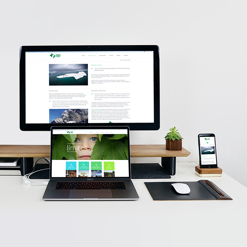
The Web Responsive or Adaptable Design aims mainly at adjusting the look of the web pages to the device used to visualize them. From quite some time, web pages are seen in countless devices of different characteristics, like smartphones, desktop computers, notebooks and tablets. Each device has its own specificities, screen format and resolution, an operating system and a specific memory capacity. The responsive design seeks that all the elements are visualized correctly in any device with a single web design.
With a single version of a website developed in HTML5/CSS Compliant it is possible to adjust to all screen resolutions and therefore to optimize the User Experience (UX).
It is the trend which prioritizes the web design developed for smartphones. Nowadays, the adaptability of our webpage is not an option, it is a must. If our design does not adjust to the different devices, we risk losing visibility in search engines (Google) thus reducing visits from potential clients who use mobile devices exclusively.